Overview
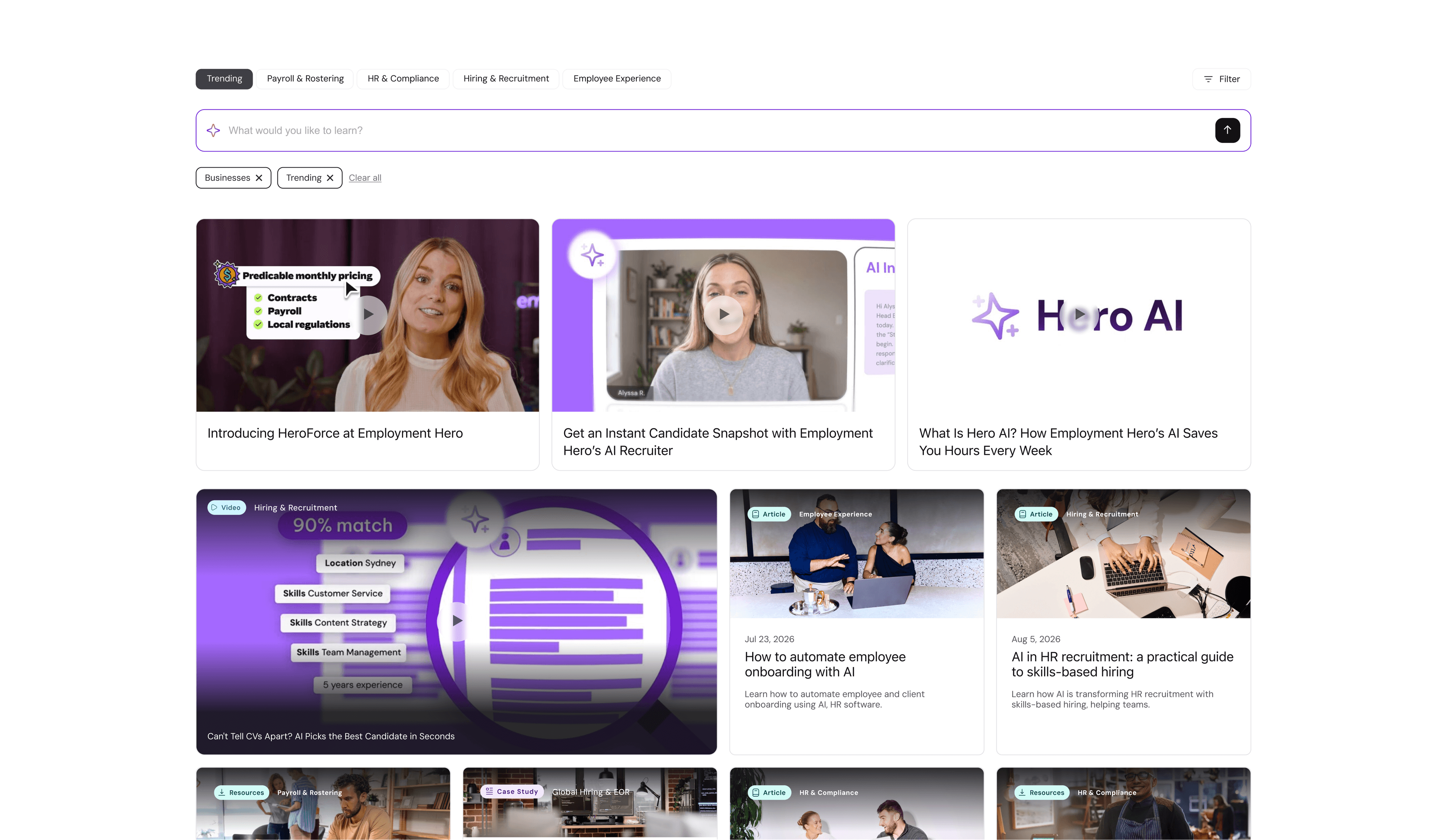
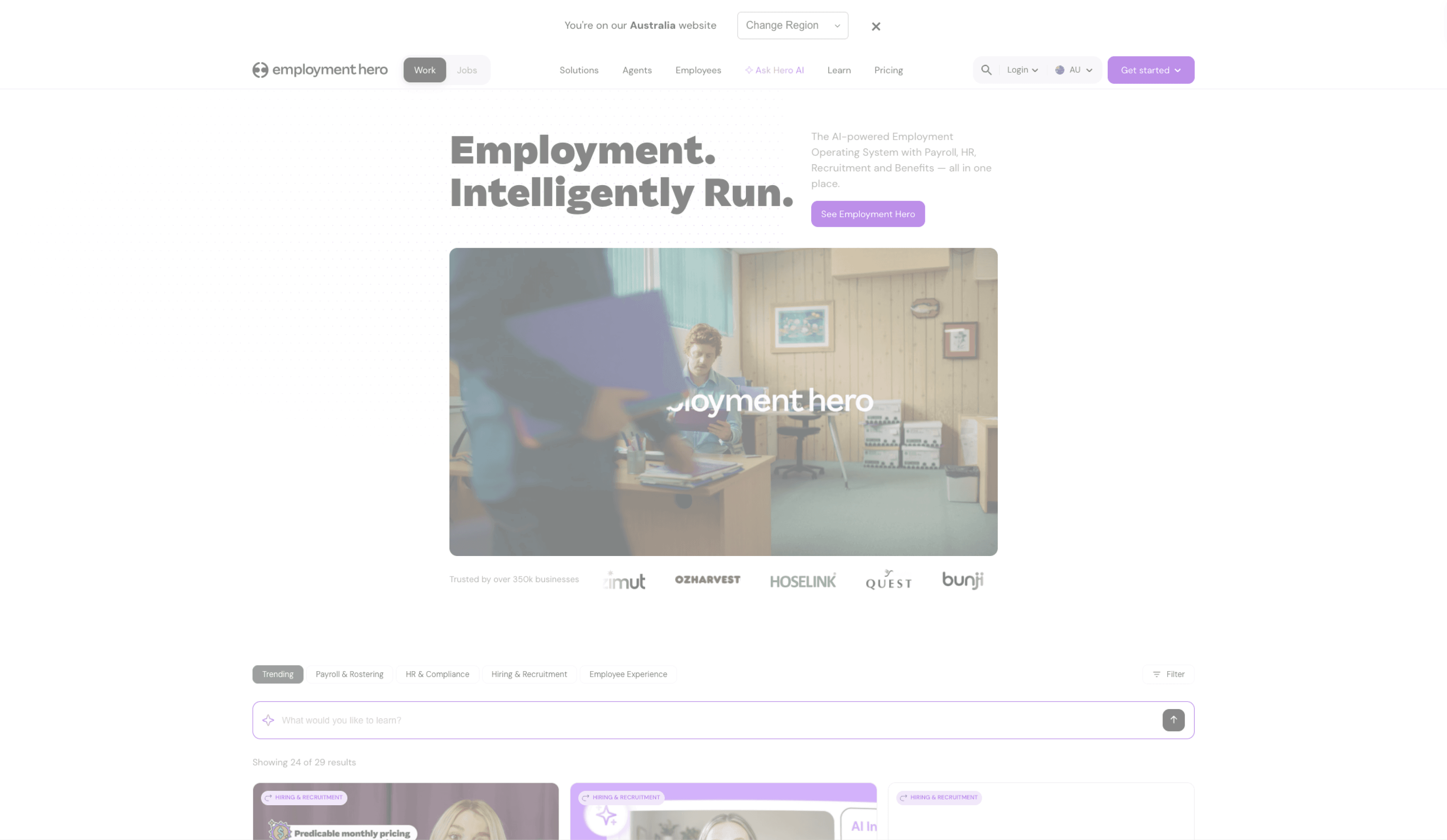
Set the strategy for Employment Hero's website, the front door for 1.7M visitors a month across four markets and three audiences: businesses, employees and job seekers. Then led the redesign that put it into practice.
Context
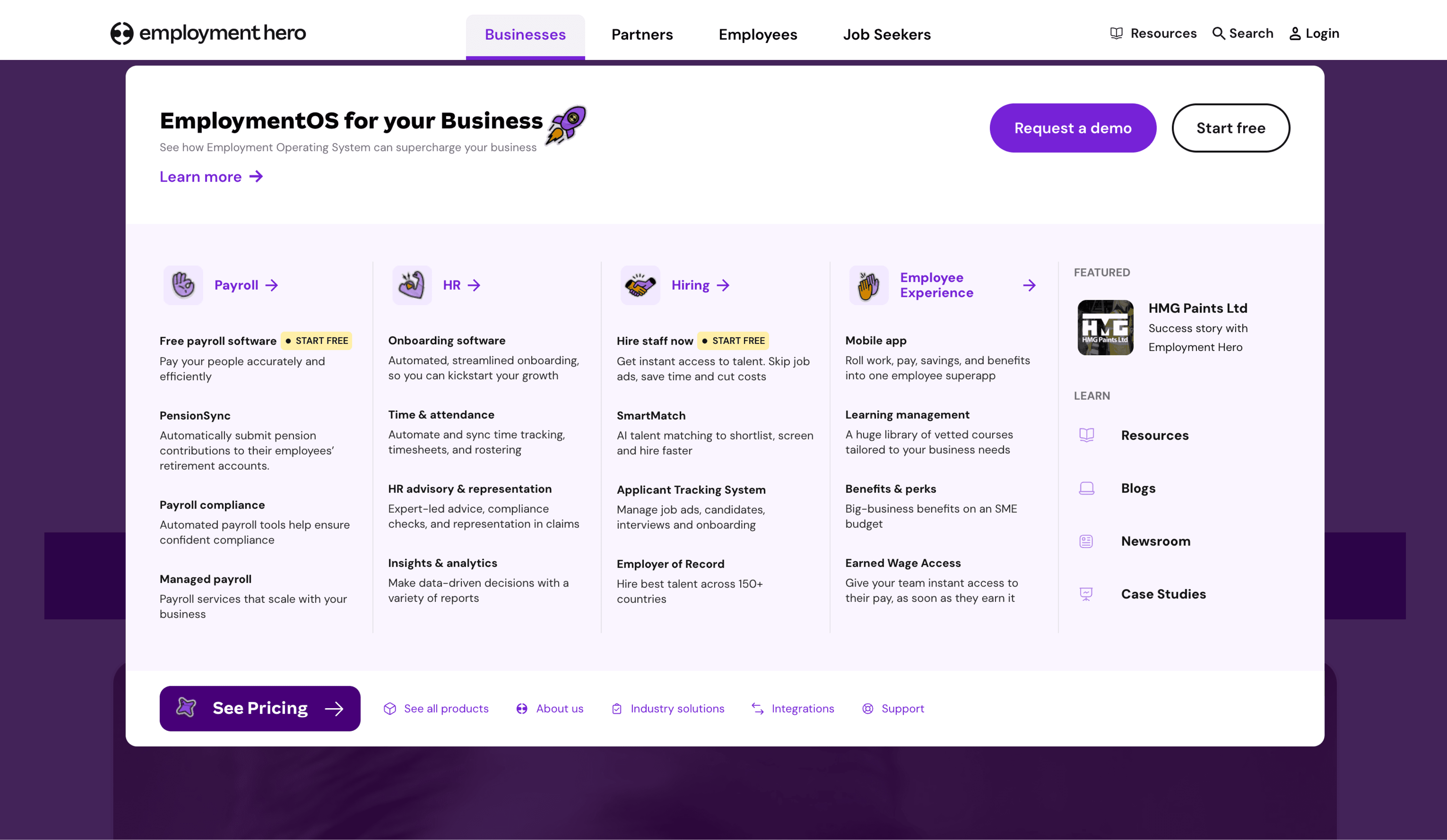
One site, three audiences, no differentiation. Whoever you were and whatever you needed, you landed in the same generic experience and were routed through the same eighteen-option mega menu.
Insights
Most people gave up before finding what they came for. They weren't browsing; they needed to be routed. And as AI spread across the product, the expectation was shifting from hunting for answers to simply asking for them.
Problem
This wasn't a homepage refresh. A one-size-fits-all site couldn't serve three audiences without shortchanging all of them, and AI features shipped without a shared model were starting to feel inconsistent everywhere they appeared. It needed a direction, not another layer of fixes.
Solution
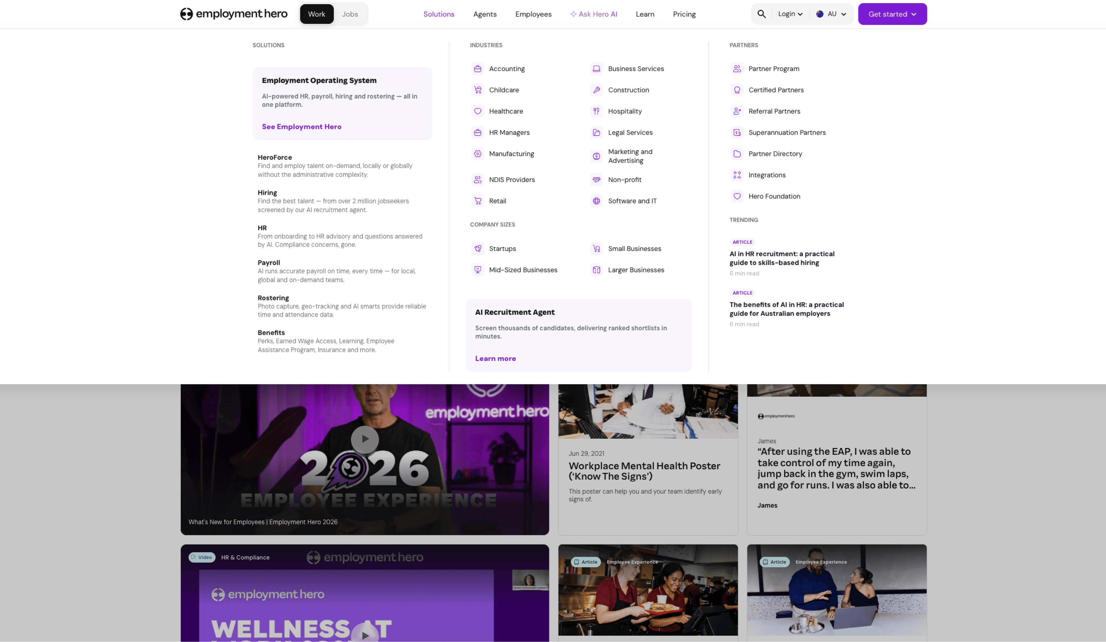
Four calls set that direction. Organise the site around who's visiting: persona-specific paths for businesses, employees and job seekers, so each visitor lands somewhere built for them rather than a shared compromise. Give Hero AI a dedicated, always-visible place in the header instead of burying it in a menu. Turn the Learn hub from one undifferentiated blog into content that surfaces by relevance. And set one interaction framework so every AI touchpoint, across product and marketing, behaves the same way.